5 UX Problem-Solving Tips You Should Know

There are Always Challenges in UX Design, But Not Always the Ones You’d Expect
Healthcare is certainly an industry where innovation is lacking, and not for lack of trying. The industry is slow-moving and always a little hesitant to react, understandably, as there are often many repercussions if done wrong. One such company doing its part, however, to shake things up a bit and introduce a new way to add value to the lives of medical professionals and the systems that employ them is Flexwise Health.
Flexwise Health is an innovative on-demand staffing platform giving hospitals and nurses a more flexible approach to clinical staff coverage. Their web-based platform aims to place the right nurse in the right place at the right time. Not an easy task, but a task they have embraced and executed with the willingness to listen closely to all parties and pivot when and where necessary.
In the process, we were tasked with the job of creating a user experience and interface that would address all involved parties/users in the best way possible and take into account the difficulties this area of the healthcare industry is facing. This process certainly came with its challenges. Below are five challenges that stood out in the process of working to streamline their SaaS platform to create a smooth process while delivering the best user experience possible for all users.
-
Not All Audiences are Created Equal
Well, they are all indeed "created" equal, but they're not equal in how they interact with software. In the case of the Flexwise Health platform and ecosystem, we are dealing with three distinct audiences.
- The first being the "Service" audience consisting of Flexwise employees and management.
- The second being "Facility" users which are those that guide the ship at various healthcare systems/hospitals.
- And finally, the third being the professionals themselves.
Since they are all users in the healthcare industry, you would assume there is a similarity between the three – and there certainly is. However, the differences between each far surpass the commonality. It’s a complex situation in terms of user experience. To simplify, here are the most distinct differences between the three user groups.
Service Audience
They are most familiar with the platform, therefore, are willing, and in most cases, requiring the ability to skip general "leading" and want to get right to the meat of what they need to achieve making it less about the aesthetics and more about quick access to more content per screen.
In this case, the goal was to provide access to as many records possible in the given screen real estate.

Facility Audience
The Facility Audience has a way they are used to doing things. They're not ready to throw it all away and do something completely different. Some familiarity is needed for comfort and at the end of the day, they need to fill hours quickly and make sure their patients and shifts are well addressed.
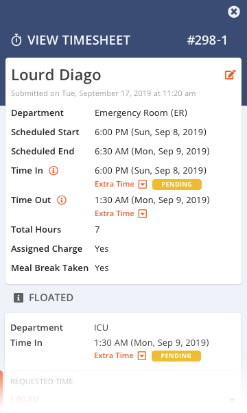
An example of this is the messaging system. Our goal was to use patterns and functionality they are familiar with while making sure it was aesthetically pleasing and provides a smooth process of managing messages between many parties.


Professional Audience
They've "been there, done that". They need to accept shifts, make changes, find the right parties to communicate with and don't have time to do it all on a desktop computer. Enter the necessity for mobile more than any other audience. Why? It's what has become most convenient for them.
Aesthetically pleasing, emphasis on hierarchy, and mobile-first.

-
Choosing the Best Approach
With such a broad range of audiences, how best to approach it? We found that a clear idea of where each user would enter the software, and the device on which they would enter, was the first step to a great experience. In addition, the amount of web-splaining was important to stay aware of.
Service Audience
For the service audience, they didn't need heavy guidance on what to do next. They simply needed what they needed as quickly as they could get to it. The familiarity was already there.
Facility Audience
For the facilities admins, they needed general guidance, without getting too deep in the weeds, on desktop only, for the most part. Oh, and don't introduce too many new processes too quickly. A little at a time — show the value first.
Professional Audience
As for professionals, this is a new platform. Keep it clear, concise, but don't skimp on guiding them through the process. And above all else, please make sure it works on mobile-first.
-
Mobile First is Ideal, but Not Always the Right Answer
As to that last point, we often hear that mobile-first is the only way to go. We're here to say, that's not always the case. We deal in technology. Technology is fluid and malleable. While it's often easy to say "here's the clear-cut solution", that's not always the case.
And in this case, for Flexwise Health, it was a matter of the right approach for the right audience.
Service Audience
In the case of the service admins, they care about desktop only. That is, they are going to be in front of a desktop 99.9% of the time, looking at a LOT of data. More so than could possibly be displayed in the best way possible on mobile. So, for them, it was desktop first, and always.
Facility Audience
For facility admin users, they were most often going to be entering from the desktop side as well, with the rare occasion of mobile. This being the case, we approached it with a desktop-first, mobile-sometimes approach. This meant really understanding what was a necessity on each platform and dividing and conquering as necessary.

Professional Audience
When it came to professionals, it's mobile-first from the start. That is, if it can't be done on mobile, it doesn't make it to desktops. And in the end, mobile to the desktop was simply a scaling issue making sure all functionality was available to them regardless.
-
Sometimes the "Best" is Not the "Best"
After 20-plus years in web design, you start to feel like you have a good gut read on what users want. And sometimes, users, after giving you feedback through research, feel like they know what is best. I can assure you, both will eventually have moments where the said "best" is not the best.
Be Flexible
The solution to this is the willingness to be flexible. As UX/UI designers we need to be willing to accept that what we feel like we know is not always right. And sometimes, just because we heard it in research results, it's not always right as well.

I like icons. In many cases, I’ve heard users say they prefer icons. Less space and visually noticeable. While we started with icons we eventually moved to the age-old and time-tested dropdown menu.

Listen
Be willing to listen, execute, and change when necessary. Be willing to experiment and open yourself up to feedback. Sometimes the best solution is one that no one person saw coming. There are moments where the research says one thing and when revised does not get the response you expected. It's about flexibility and the willingness to change it up when the opportunity allows, and time to be flexible when you think you have the answers. Just like the technology we use, we need to be prepared to be flexible and malleable whenever possible. It's an opportunity to grow and learn something new.
-
Letting Go of Real Estate
I'm a huge fan of whitespace and I'm not afraid to claim it and shout it from the rooftops. You might be the same. If so, always be ready to have that affinity shaken up.
Service and Facility Audience
Yes, the "above the fold" is an oft argued point that many believe is not as important today. I'd be the first to argue that as the case. However, I believe that is first, and foremost, defined by the user, not by us as designers. In the case of Flexwise Health, the service and facility users know what they need to sift through and they want as much on screen as possible to make their job more efficient.
Professional Audience
In the case of our professional users, whitespace adds to the clean and clear layout and is certainly appreciated. But what about those users that benefit from the efficiency of seeing as much as possible in as little screen real estate as possible?
A challenge for me was letting go of my personal need for whitespace and identifying how best to use the space we had available to present the most information. This was most apparent in the professional list pages. Letting go of my personal likes, and revisiting the use of real estate made for a design that I actually loved more than my previous design. Users spoke, I listened and we're both happier for it. Don't get too set in your ways and you'll find that often the solution that comes out of it creates a successful interface that you're proud to show off.

Final thoughts
I approached this post as an opportunity to get very specific about aesthetic UX design challenges and how we overcame them. However, what it boils down to are challenges that arise having nothing to do with little "d" design (read interface or graphic design) and far more to do with big "D" design. That is a far deeper problem-solving and flexible approach to designing an experience that isn't necessarily going to give you all the aesthetic-feels but certainly resolves issues that a human has with using your software. And, if the user is happy, the functional goal has been achieved. That should make us, as designers, incredibly happy.