How to Improve Your Website With These Simple CSS Ideas
Our CSS Expert Shares 7 Use-cases to Raise Your CSS I.Q.
Cascading Style Sheets, or CSS, as it is commonly referred to, is the coding language we website developers use to create the look and feel of your website. I've been using CSS for the better part of two decades. During that time there have been dramatic improvements and changes in how CSS works within websites. At MojoMediaPros, we value quality CSS to improve visual interest and usability across all devices.
My purpose in writing this article is to introduce the less technical website producer to some of the more interesting and useful things that can be done in CSS. Knowing what's possible, is an important first step to having more informed conversations with your web developer.
Seven Simple Ideas to Add to Your CSS Repertoire
-
Animations
CSS animations aren't always the best choice for everything, but when they work, they can be smooth, responsive, and load much faster than a video. Check out the simple animation I created below by clicking the "See CSS Animation" button.MOJO MEDIA PROSDesigner Note: Developer Art
 A more sophisticated example of a CSS animation is the animated laundry list of auto manufacturer names we created for our client, North Hills Automotive. NHA needed something to spice up an otherwise simple page and they had already been informed by at least one OEM manufacturer that they could not legally use the Auto maker's logo in this context. The CSS animation we created is not only SEO and mobile-friendly, but it also adds virtually no extra load time. CSS animations are ideal for visual effects, embellishing graphs, moving text, shapes, or blocks of color.
 -
Create alternate versions
Need to see an alternate version your website with a new color scheme, different fonts, and headline sizes? CSS makes it easy. By swapping out the CSS file, you can instantly change the look and feel of the site while leaving your content in place. As long as the website was built with a logical and consistent structure, it's easy to make these changes.
On a past project, we were asked to create a single interface suitable for various types of visual impairedness. The solution was a simple dropdown menu with multiple high-contrast color schemes from which the user could choose their preferred accessibility interface styling on-the-fly without impacting the content or layout.
CSS made this challenge relatively easy. Use the three buttons below to see alternate versions.
-
Create adaptive content
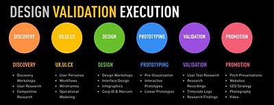 Modern websites need to look good and work correctly across different devices (desktop computers, tablets, phones, etc.). Sometimes this requires something simple, like reducing a two column layout down to a one column layout. This is a common practice for smartphones. Other times, it's more complicated. For example, on the MojoMediaPros homepage, we have a services chart labeled “Design Validation Execution”. If you view the chart on a desktop computer, the section displays in a horizontal layout, and when viewed on a smartphone, it becomes a vertical layout to fit the aspect ratio of the smartphone screen.
 -
Create an alternating content layouts
 In the past, if you had a large list of information and wanted to differentiate every-other list item, you would need to either go back and manually create different formatting for each item or use a javascript solution. With modern CSS, you can very easily target any order of content. A simple way to think of this is to target just the even or odd items in a list. For example, on the MojoMediaPros website“Services” page, we use a two column layout for desktop computers. The sections on the page alternate right/left formatting. This was achieved very simply through CSS.
 -
Fix “ragged columns”
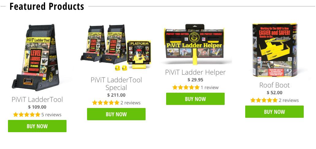
Sometimes we have two or more columns stacked horizontally. Invariably, the columns don’t have exactly the same amount of content. Since we try to avoid miss-matched columns, we need to make the columns appear the same length in order to make buttons and lists match up. Using a tool of CSS called Flexbox, we can do just that. Button to toggle flexbox example from the ProvisionTools online store.
-
Customize off-the-shelf solutions
 For our client Aspen Grove Dental, we wanted to create an SEO and mobile friendly slideshow header. We used an off-the-shelf slideshow plugin and customized how the images and text flow based on the slide content and the user’s display device. We also improved usability by repositioning the left and right navigation arrows outside of the images and restyling and repositioning the current image indicator, below the slides.
 -
Change it up
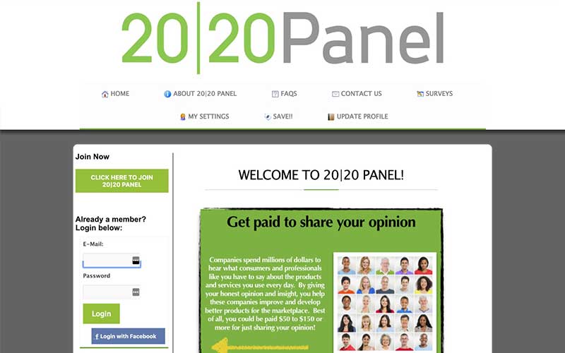
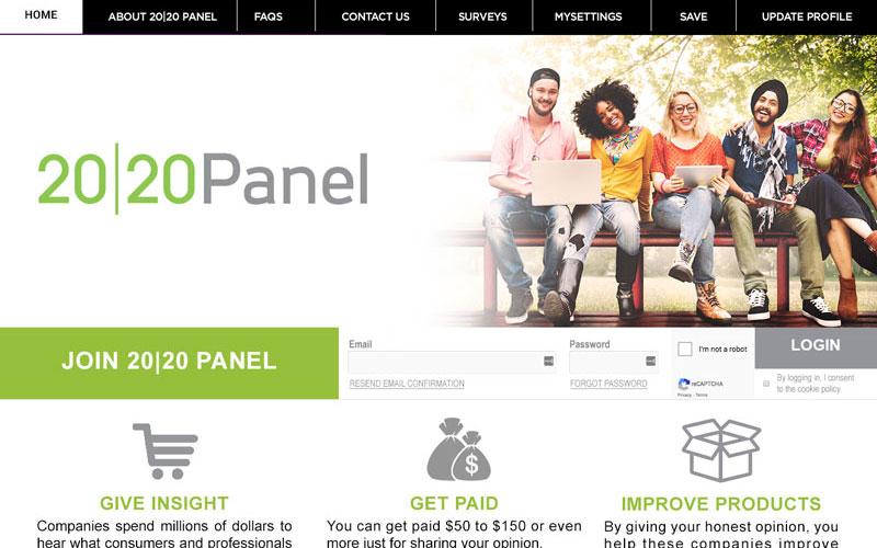
CSS can aid in creating a radically different website without starting from scratch. For 2020 Research, MojoMediaPros had an interesting challenge. We were asked to create a fresh new look for a portal site, that was reliant of legacy technology. The idea was to bring the portal up-to-date to match the general aesthetic of their corporate website. We weren't allowed to change templates or edit the template HTML. The only changes we could make were to the CSS, and we had to do that while the site was online and fully functional. We could not disrupt the live site until the styling was approved. This approach is a little like changing a tire on a vehicle while it’s driving down the highway! We accomplished this by using a code injection plugin, that allowed us to see the real impact of our changes on the live site without sharing those changes with the public. Below, you can see where we started and where we ended up.
Conclusion
Whether you have an older website that needs modernization or you’re ready for something entirely new, reach out to MojoMediaPros for a comprehensive website business plan. We can’t wait to hear from you!


